/ Works

Redefined Spaces

Brand strategy, identity system and full visual rollout for a property development company built to do things properly, from site hoardings on London streets to a material palette for every property.

/ Overview:

Client

Redefined Spaces

Year

2025 - Present

Role

Brand Strategy
Visual Identity
Brand Guidelines
Website & Digital

Redefined Spaces is a property development company founded by Richard Hew on a straightforward belief: property should be done properly*. Quality build, thoughtful design, responsible management. No short-term thinking, no poor materials, no decisions made on cost at the expense of people.

Richard had the ambition to grow across larger-scale developments, long-term residential lettings and commercial projects, but needed to work out how all of that could sit together as a single coherent brand. Saltco started with a Strategic Intensive: working through the business model, auditing the competitive landscape and building out the brand architecture before a single design decision was made. The result was a clear structure: Redefined Spaces as the master brand, with Redefined: Living (ethical landlord and residential rental) and Redefined: Developments (commercial and design-led projects) as distinct sub-brands beneath it. Each speaks to a different audience. All three are unmistakably part of the same family.

Redefined Spaces
Redefined Spaces

Bold by design.

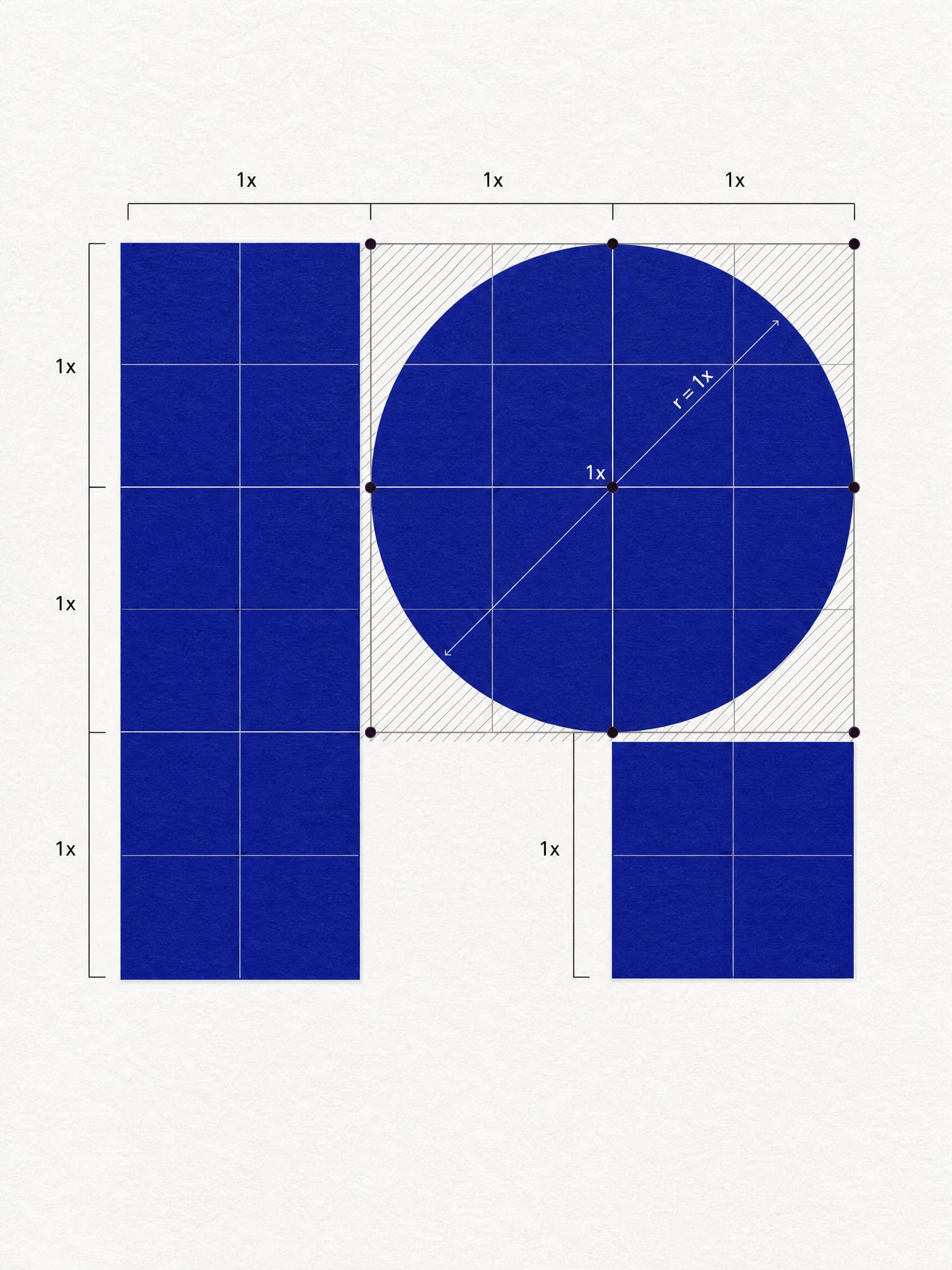
The Redefined brandmark was designed from first principles: three geometric shapes (rectangle, circle, square) assembled into a precise grid to form a stylised 'R'. Each shape carries meaning, the rectangle for tall commercial and residential developments, the square for homes and residential living, the circle for shared and community spaces. Together they form the master mark, which adapts across the three sub-brands with a single word swapped inside the circle to signal which part of the business it belongs to. The logo doesn't just identify the brand, it maps the business.*

The palette is bold by design. Royal Blue, unambiguous, direct, nothing like the muted tones most property developers reach for. Juxtaposed against an acid yellow-green that makes branded vehicles, site signage and printed materials immediately recognisable. The identity is rooted in Bauhaus principles: simple forms, functional thinking, structural clarity. Across notebooks, tote bags, branded posters and the website, the geometric forms from the brandmark become a flexible graphic language, consistent across every surface it appears on.

Redefined Spaces
Redefined Spaces

A brand built for the real world.

A property brand lives in the physical world more than most. Saltco designed and produced the rollout across every surface Redefined occupies: contractor uniform and branded hi-vis workwear, site hoarding and scaffolding wraps, branded vehicles, notebooks, tote bags, clipboards and printed collateral. The identity holds at every scale*, as bold and legible on a building site hoarding as on the cover of a quarterly publication.

Alongside that, Saltco developed a Redefined Living interior design look and feel document, a curated material palette and supplier guide that lets Richard's team finish rental properties to a premium standard at affordable cost. Brass tap hardware, oak flooring, terrazzo tile, blackened steel, textured plaster, the kind of considered choices an architect would make, codified into a repeatable system any contractor can follow.

A property brand lives in the physical world more than most. Saltco designed and produced the rollout across every surface Redefined occupies: contractor uniform and branded hi-vis workwear, site hoarding and scaffolding wraps, branded vehicles, notebooks, tote bags, clipboards and printed collateral. The identity holds at every scale*, as bold and legible on a building site hoarding as on the cover of a quarterly publication.

Alongside that, Saltco developed a Redefined Living interior design look and feel document, a curated material palette and supplier guide that lets Richard's team finish rental properties to a premium standard at affordable cost. Brass tap hardware, oak flooring, terrazzo tile, blackened steel, textured plaster, the kind of considered choices an architect would make, codified into a repeatable system any contractor can follow.

Redefined Spaces
Redefined Spaces

Digital platforms built around the ethical landlord model.

The master brand website was built to do two things: showcase active and completed development projects, and introduce the Redefined Living ethical landlord model to investors and prospective tenants. The brand guidelines extend into two content platforms developed by Saltco, The Good Landlord by Redefined Spaces*, an online journal and community, and The Good Developer Podcast by Redefined Spaces*, giving Richard the tools to build an audience around the values the business is built on.

The brand system Saltco built scales from a business card to a building site. It was designed to grow with the business, and it does.

The master brand website was built to do two things: showcase active and completed development projects, and introduce the Redefined Living ethical landlord model to investors and prospective tenants. The brand guidelines extend into two content platforms developed by Saltco, The Good Landlord by Redefined Spaces*, an online journal and community, and The Good Developer Podcast by Redefined Spaces*, giving Richard the tools to build an audience around the values the business is built on.

The brand system Saltco built scales from a business card to a building site. It was designed to grow with the business, and it does.

Redefined Spaces
Redefined Spaces
Redefined Spaces
Redefined Spaces
Redefined Spaces
Redefined Spaces
Redefined Spaces
Redefined Spaces
Redefined Spaces