/ Works
E1 Team Monaco X Hanikon
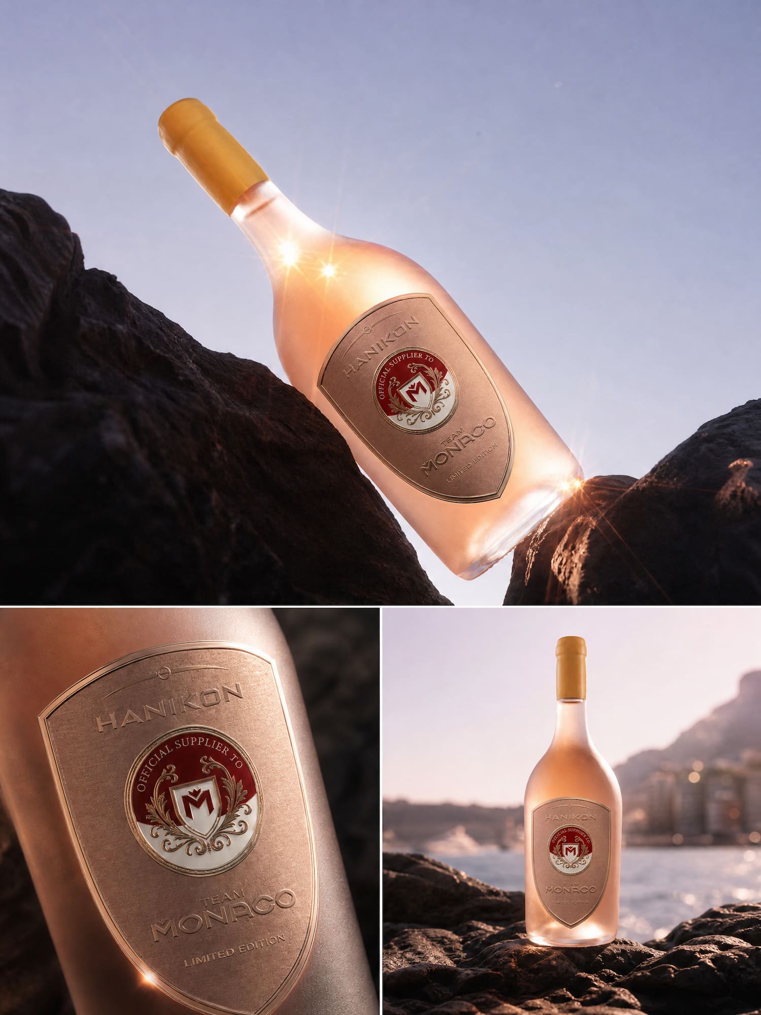
A limited-edition bottle for E1 Team Monaco, the world's first all-electric raceboat championship, designed to bring two very different brands together on one label.
/ Overview:
Client
Hayley, Founder, Hanikon Rosé
Year
2026
Role
Packaging & Label Design
Structural Design
Concept Development
Print Management
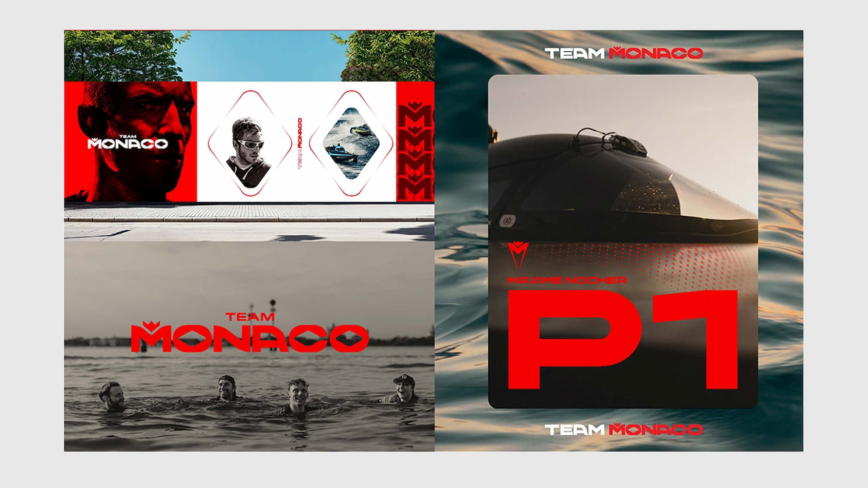
Hanikon Rosé is a luxury rosé served across some of the world's most prestigious destinations, from Harrods to Eden Rock in St Barths. E1 Team Monaco races in the UIM E1 World Championship, the first all-electric raceboat series, and came to the project with its own sub-brand, the 98 Collection.
We have worked with Hanikon for years, so we already knew the brand, its customer and what makes the bottle recognisable. Hanikon asked us to lead the packaging design for the collaboration, so we developed the concepts, designed the label and its structure, and saw the artwork through E1's sign-off and into print.
E1 had strict brand guidelines and the final say on the design. We worked through several concepts to agree the brief together, which meant the final label kept to their rules, gave both brands equal weight, and was used at the championship.

Two bold brands, one hierarchy.
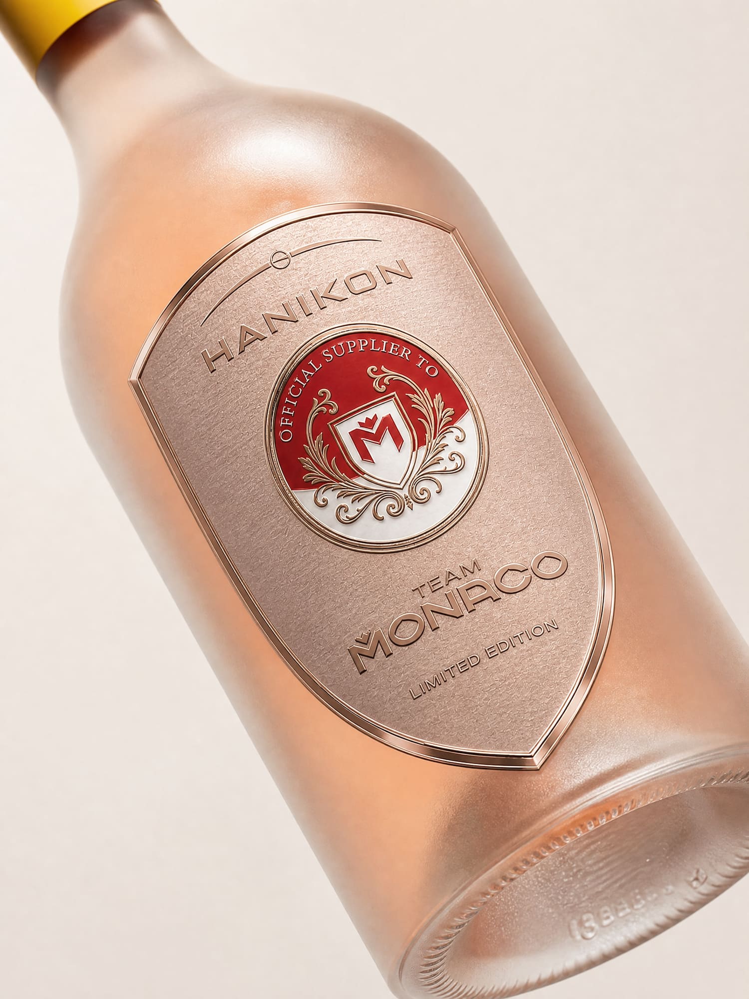
The difficulty was that both brands are bold. Hanikon is distinctively yellow, tradition meeting modernity, and E1 brings racing red, a diamond motif and the energy of the sport. Sat next to each other they fight for attention, so rather than force them together we gave them an order, taking elements from each so they work alongside one another. At the centre we designed a traditional crest, more heritage than either brand on its own, so a new collaboration felt like it had been around for a while.
The label is a shield, and its curve follows the arch of the Hanikon buckle that sits above the wordmark, with a circular crest set inside it. We used rose gold rather than a standard pink, embossed the Hanikon and E1 logos and a "Limited Edition" mark, and kept plenty of space around them. We left yellow out of the label on purpose, so the frosted bottle and yellow wax top stay the thing you notice first, which is really Hanikon's signature. We also designed the crest so Hanikon can use it again, with a set space for a partner's logo and an "Official Supplier To" line, so the next collaboration can slot straight in.