/ Works
Chrome Hearts X Hanikon
A collaboration between a luxury rosé and one of fashion's most distinctive names, from the bottle design through to the pitch and the store takeovers.
/ Overview:
Client
Hayley, Founder, Hanikon Rosé
Year
2026
Role
Packaging & Label Design
Concept Development
Pitch Materials
Hanikon Rosé is a luxury rosé served across some of the world's most prestigious destinations, from Harrods to Eden Rock in St Barths. Chrome Hearts is a cult American luxury house known for its silver jewellery and its cross emblem, with a heritage most brands would struggle to borrow from without looking like a copy.
We have worked with Hanikon for years, so we already knew the brand and its customer. We shaped the whole collaboration, from the bottle designs and their structural detailing, to the pitch deck used to sell the idea to Chrome Hearts, through to the retail takeover concepts that showed how a co-branded event would look and feel.
The brief was to make the two feel like one collaboration, not two logos side by side.
Both brands have strong, distinct identities, so before designing anything we went back through Chrome Hearts' archive imagery to understand where the brand came from. We wanted to capture its essence through a Hanikon lens, without tipping into a cliché or a kitsch version of either.


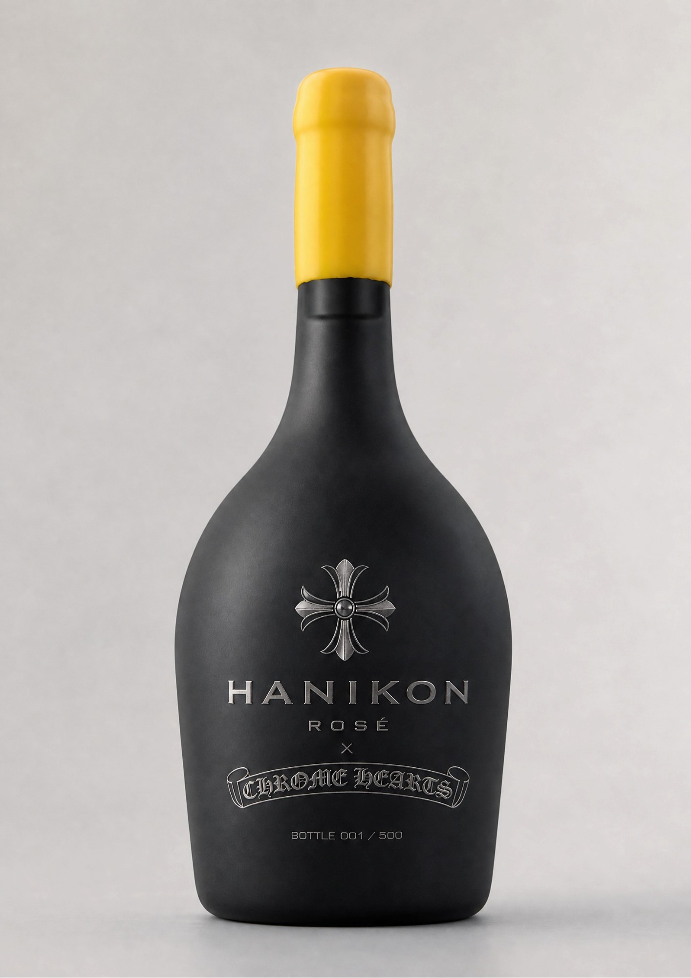
Hanikon's bottle, reworked in Chrome Hearts black.
The main design was made for Chrome Hearts' hotel in St Barths, where Hanikon becomes the official rosé, so it needed to be a more pared-back collaboration that still read clearly as both brands. Hanikon's two signatures are the yellow wax top and the frosted bottle, and we kept both, but set the yellow top against a charcoal-black frosted finish to line up with Chrome Hearts' black branding. The finish is tactile and rich, and stands out on any shelf.
At the heart of the bottle we embossed the Chrome Hearts cross in a chrome silver finish, a nod to the brand's jewellery, so it reads more like a piece of craft than a printed logo. Below it we blended the two logos into one collaboration mark, again embossed in silver, and set a discreet bottle number at the base to give the run a limited, collectible feel.